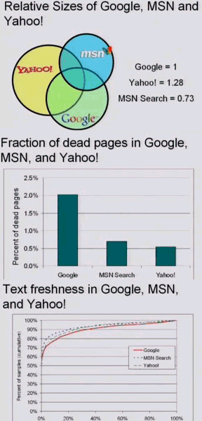
He applied the results from his paper and compared Google, Yahoo and MSN Search. Here are three charts that show a comparison of the index size, how many dead pages are in each search engine and how fresh the results are. The charts are only an estimation, and they have a bias of around 10%. As you can see, Google doesn't do very well.
To find out more, watch the video, which is fairly long (1 hour) or skip to the results. There's also the paper "Random Sampling from a Search Engine's Index" (PDF), that got the best paper award at WWW 2006.


