

What I love about Google products is that when they're finally out of beta, there's a new beta version around.
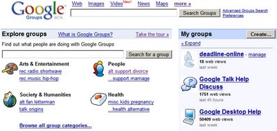
The new Google Groups Beta looks different. It has childish icons for each group, but you can change that. In fact, you can change a big list of settings if you are the owner of a group (select a template, change the navigation, access rights and more).
You can create web pages and upload files (storage: 100 MB) to a group, and that seems to be most important new feature. The web pages can be edited by more people at once and Google Groups shows all saved versions. People can also comment on the page.
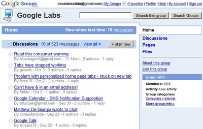
Google lets you create a real profile: now you can add a picture and more information about yourself. Each user has a rating, the average rating for your posts.
There's no left sidebar. The recently visited groups moved to a quirky menu that can be accessed from the "My Groups" link. Google merged the two search boxes, so the interface looks cleaner.
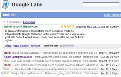
Messages from a topic look exactly like a Gmail conversation, each message is collapsible, can be forwarded or printed. If you don't look carefully, you'll think this is not Google Groups, it's Gmail.
All in all, the new design seems a combination of Gmail and Yahoo Groups. The tight Gmail integration is a nice addition, while the file storage might make migration from Yahoo Groups easier. To quote Mr. Justin Timberlake, Google Groups brings sexy back, and it's mature enough to have all the feature you need.
We can conclude that this is the first transplant from the new Google to the old Google (Google Groups was launched in 2001) and the patient feels much better.


