Google Reader team has finally realized that nobody likes their interface (well, except for a couple of noisy people). I know it's cool to see all the new posts in a continous flow, but nobody reads news like that.
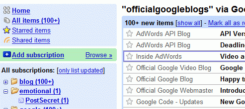
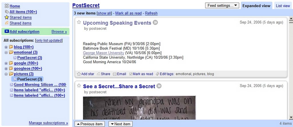
So Google Reader adopted the best way of creating a feed reader: Bloglines. No, they didn't buy it from Ask, they decided to do their own Bloglines. The difference is that Google Reader uses labels, instead of folders.
Other new features:
* Expanded view and list view (similar to Gmail, list view shows only the title and a small snippet, while the expanded view shows the entire post)
* Simplified sharing functionality (just click on the share link, and add snippets from blog posts to a public page. You can share that page with your friends, so they can read your favorite pieces.)
* Infinite scrolling (no upper bound for how many blog posts you can read and instead of clicking to read the next post, you can just scroll)
* Unread counts (can't count more than 100 items)
* Mark all as read
The new interface is much better, and uses more from the screen space. You also have a list of feed packages you can choose and a "Next" bookmarklet you can add to your browser to read blog posts directly from their site. The only questions are why Google Reader is not a part of Gmail yet and where is the search functionality.